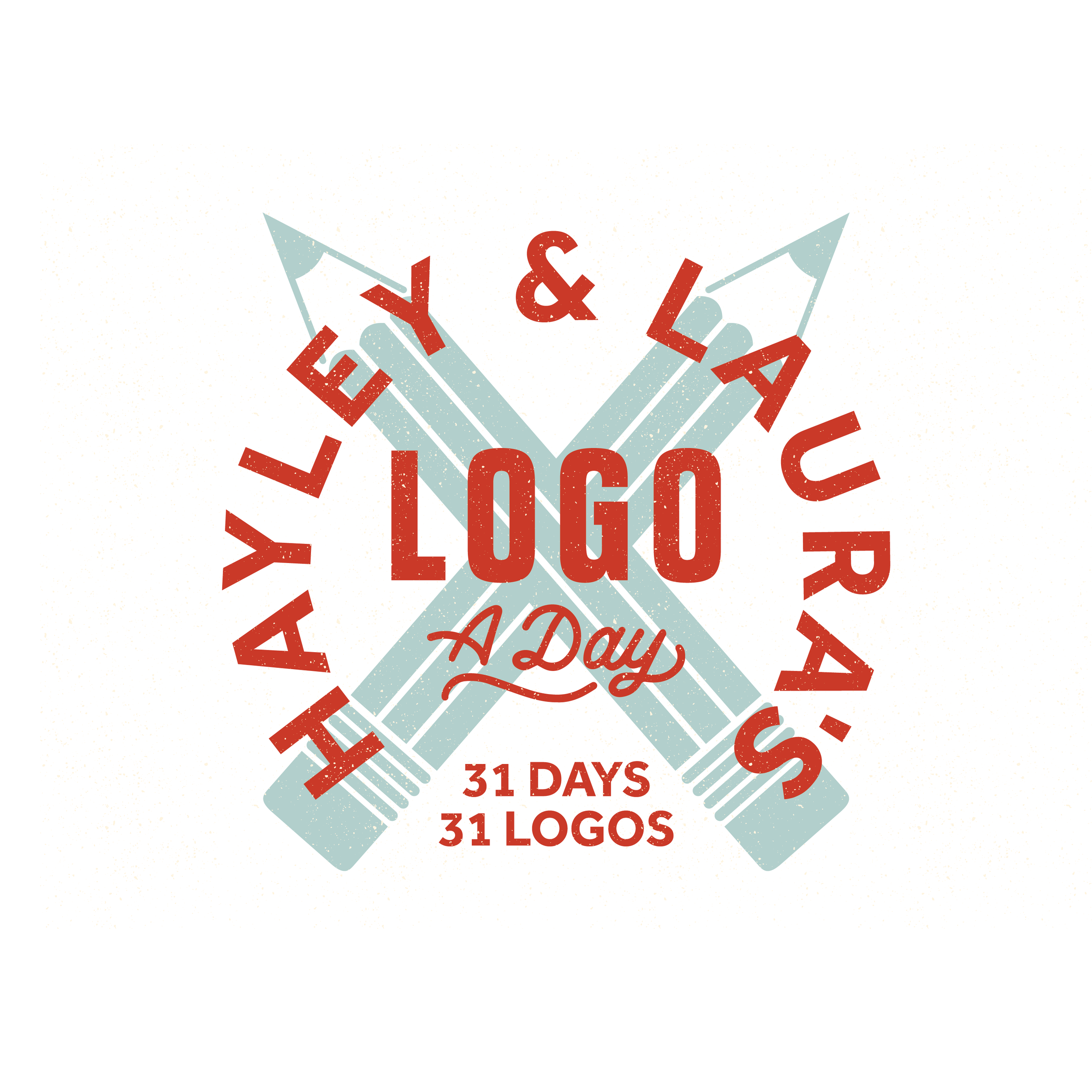
I Designed 31 Logos in 31 Days, Here's What I Learned
In July of 2022, my good friend and fellow designer Laura Adams and I set off to design 31 logos in 31 days. It was a big goal but we were excited about it, so we put together 31 client briefs for pretend clients (which you can still find by clicking here!) and when July 1st hit, we got busy designing, along with all the other amazing artists who decided to design along with us.
Now that the project is finished and I’ve had some time to reflect on it, here are 6 things I learned from designing 31 logos in 31 days.
1. PRACTICE IS BETTER WITH A PURPOSE
I’ve always been a big believer in practicing your craft with a clear vision and purpose, but doing this challenge made me even more certain that practicing with purpose is key to developing your skills. For this project, we weren’t just sitting down and designing whatever we felt like at that particular moment. We were sitting down with a client brief and a clear problem to solve. I believe that when you focus your practice as a designer on solving a problem that your practice will be more effective and will allow you to grow. I know that as I came up against prompts that I thought would be difficult (like Marley and Marley accounting, Day 3,) I was surprised how much I liked the results of my work; results that I never would have created if I were just designing for myself and not a “client.”
2. THERE’S MORE THAN ONE WAY TO SOLVE A PROBLEM
Perhaps the most rewarding part about doing this challenge was seeing how differently everyone approached each design prompt throughout the month! I was amazed and delighted at the end of ever day to look through and to see how solid the designs were and how differently and effective some of them were. As designers, I think we sometimes feel that there is ONE solution that we have to find, but the fact is, there are so many ways to create a design that will work!

For my logo, I wanted to do something that felt traditional, crafty and decorative.

This design by Caring Ink was such a fun crafty style of design that perfectly worked for the project.

Laura did a very modern, illustrated design for her logo with so much personality!

Kaylee Prunty used a chair as a pin cushion for her logo and it worked perfectly!
3. TARGET AUDIENCE MATTERS
In our design briefs one thing we didn’t focus on was target audience, or the people who would actually be using the product or service. Because of this, there were several times were Laura and I designed very different brands because we were imagining different target audiences for those brands.
For instance, on day 21 the design prompt was for a present event company called Marvel & Bliss. The brief went as follows: “Every aspect of event planning for the everyday socialite. Marvel & Bliss make dreams come true with their exclusive network of luxury service providers.”
As soon as I read that description, I immediately pictured this company servicing rich classy southern ladies who like to host garden parties in the backyard. The client I was picturing was an upper class woman who reads Country Living magazine and loves to be a hostess even for small occasions. Based on that client who I was imagining in my head, this is the logo I designed:

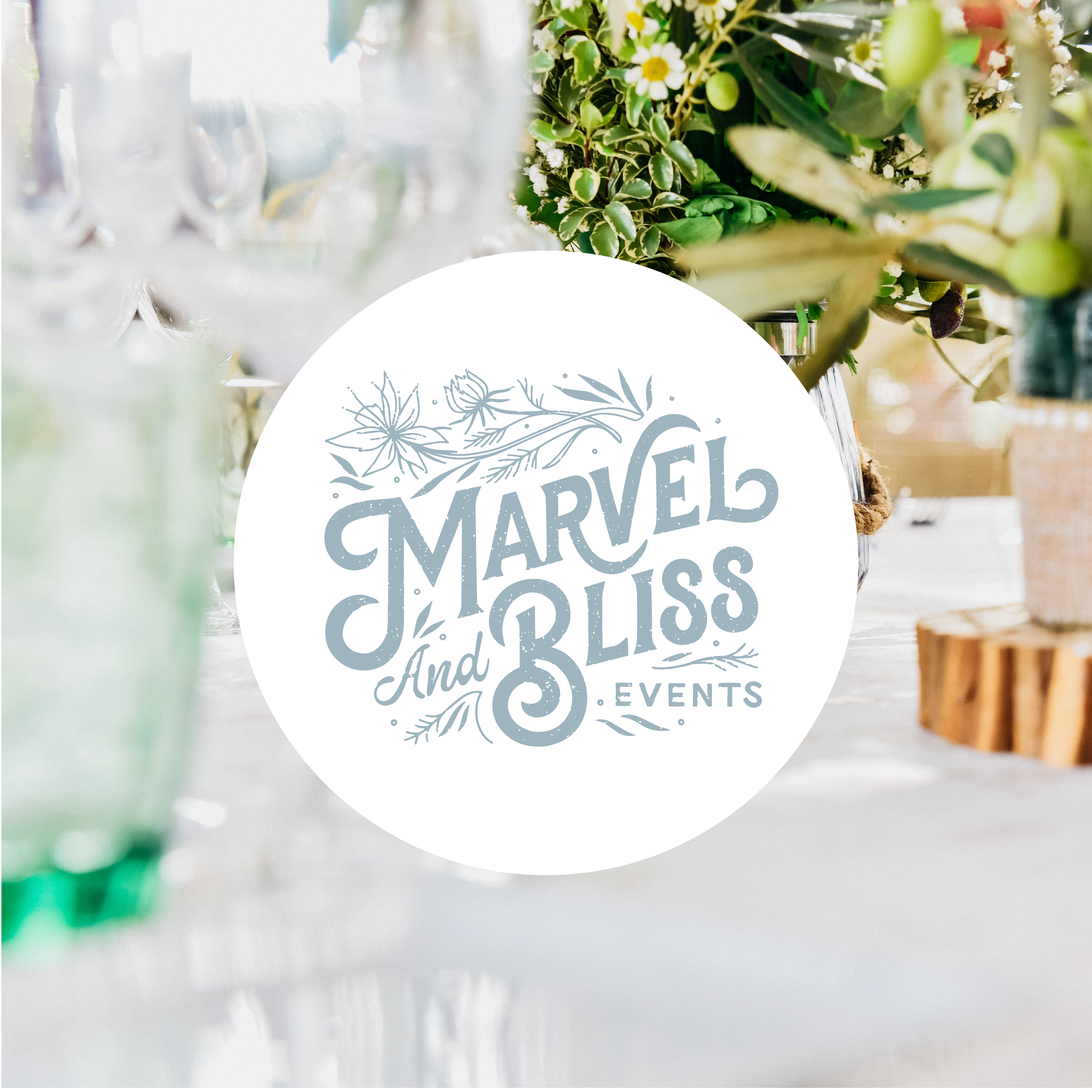

I had gone one route with this design, so I was very surprised when I saw Laura’s designs for this brand and realized that she had gone in a completely different direction with hers! When Laura designed her logo, she was imagining the target audience as young, millennial influencer types looking to throw a party. Her target audience was young, fun and bohemian. Her brand serviced the kinds of people who want to go to a party that is worth sharing on the gram.


Even though our designs were very different, neither of them were wrong! But it was a good reminder to me that when you’re designing, it’s not only important to know WHAT the client does, but to know WHO they do it for.
4. DON’T BE AFRAID TO TRY WILD COLORS
As a designer, I personally have my own favorite colors that I’m biased towards, and sometimes it can be tricky to move outside of your comfort zone when it comes to color. When Laura and I were coming up with these design briefs, we decided to include a color palette with each one, and some of them were wild! More than once I looked at a color palette and thought “what the heck am I going to do with this?” But I found that stretching myself and venturing out in to the world of unexpected color choices was a real treat!

The colors for Vespa Italia were colors that I found in one of my old 1950s magazines!

The colors for this flower shop especially freaked me out (orange and purple?!) but they ended up being a lot of fun to work with!
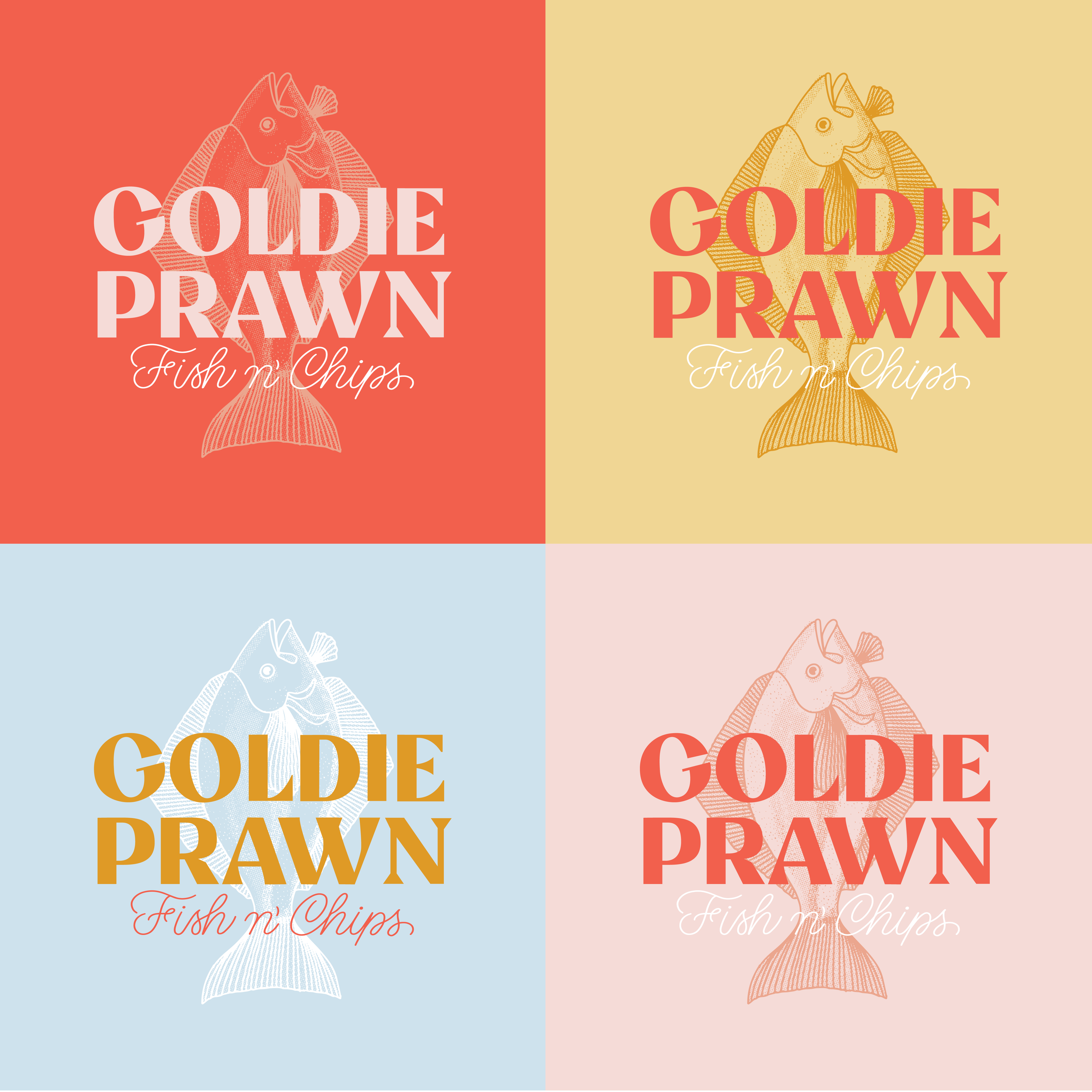
These were colors I never would have picked on my own, but they ended up being so inspiring! I felt like the colors were the driving force in this design.
5. ONE DAY IS NOT ENOUGH TIME TO DESIGN A LOGO
As fun and rewarding as this challenge was, the biggest lesson I learned is that one day is NOT enough time to design a logo! As a way to practice, this was a great activity, but it was also a good reminder of the time, care and thought that are required to create finished work. In real life I typically spend 3-4 days doing research and sketching out ideas before I even send the client options to pick from. Although we did fast work for this project (because we had not choice,) the best work will always take time.
6. GET YOURSELF A BUDDY
If I would have been doing this challenge alone, there is NO WAY it would have worked out so well. The fact that me and Laura did this together is what made the experience so special. Having a friend, a community and a support system is fundamental to being a successful artist (in my personal opinion.) Throughout the month Laura and I were constantly talking to each other about ideas, giving each other feedback and learning and growing together. But we don’t just do that when we’re working on a design challenge. I know anytime I have a question or am stumped on a design, I can talk to Laura and get her honest options and advice. If you don’t already have a friend like that, get one! Being a designer can get lonely, don’t go it alone. And be sure to check out all of Laura’s amazing work!

IN CONCLUSION…
I had more fun working on this challenge than I ever could have imagined. I ended up waking up every day excited to see what the next client brief would be and I’m very proud of the work that I did! It was also so wonderful working with Laura, I couldn’t have done it without her!
If you missed out on the challenge, no worries! The design prompts are all still available here. If you want to see all the amazing work that people created as part of the challenge, visit the hashtag #hl31logos on instagram. For to see all the logos I created over the past month and some more info about my thought process on each one check out this blog post.
Do you like design challenges? Have you ever done a 30 day project? What did you learn? Please feel free to leave your comments or questions in the comments below!