A Deep Dive Into the 31 Day Logo Challenge
In July of 2022, my good friend and fellow designer Laura Adams and I set off with a goal to design 31 logos in 31 days! We had a grand time and were successful in accomplishing that goal. Here’s a deep dive into the designs I created throughout the month and some thoughts behind each one. To learn more about what I learned during this experience, check out this blog post! Enjoy!
DAY 1: MAKE BELIEVE STUDIO
For this design the goal was to create a logo for a video studio owned by two sisters that specialized in shooting videos with film. I’ve always loved vintage inspired lettering so I thought this would be a good opportunity to create some 1950s inspired letterforms. I wanted them to feel fun but not to girly and still solid and legible. I also included the stars as another nod to vintage design. I especially enjoyed the colors for this one!
DAY 2: TORONJA
For this design it was important to me to make something that felt juicy and delicious. Toronja is a juice bar and a popular hang out spot for customers. I didn’t want the design to feel to boring and sterile, but I still wanted it to feel clean and healthy. I thought the juicy script lettering was a good solution that accomplished what I was going for. For this design, I also created some packaging to go along with the design. I actually made a label and photographed the bottle myself (sometimes stock photos just don’t cut it!)
DAY 3: MARLEY AND MARLEY
I was unexcited about the idea of designing a logo for an accountant, but since this wasn’t for a real client and I didn't necessarily have to do a basic, professional logo like you might expect for an accountant, I had a lot of fun. I thought it would be cool to create a logo that was detailed and intricate that also had some ephemeral elements. Since the name Marley and Marley is a reference to A Christmas Carol, I decided to use a door knocker as an icon.
DAY 4: BOX BROS
This concept for a moving company needed to be simple, clean and straightforward, but that didn’t stop me from hand-lettering the main logo. These letterforms were more simple than what I normally do, but I still felt it was important to make sure they were custom and hand drawn. I decided to include a basic mockup for the moving app as well.
DAY 5: GUSSYLOVIE
Of all the logos I designed this month, this one was definitely my least favorite. I felt like the design I came up with was weak and uninteresting. I have a tendency to me more attracted to brands that have a vintage or old fashioned element to them, so designing something to feel modern is not my favorite. Out of all the designs, this is the one I’d like to go back and change the most.
DAY 6: WILLOW TREE GREENHOUSE
After struggling with the salon logo the day before, it was a real treat to work on this design. Willow tree greenhouse was supposed to be a business that felt small-town, easy going and earthy so hand lettering was a good fit for the logo. I wanted the letters to feel like they had a solid structure while also having some movement.
DAY 7: INSIDE AND OUT
This day also happened to be the same day as my little sister’s wedding so I was on a bit of a time crunch as you might imagine. Although I didn’t have time to explore this concept further, I still felt like the lettering conveyed what I wanted it to. It was clean, friendly, open and inviting while still feeling professional. I love scripts and feel that people tend to overuse sans serif styles when they want to make something look clean and simple; using a moonlike script can be a great alternative to that.
DAY 8: RED CLIFF ADVENTURES
For this logo, I really wanted to make something that was very illustration based. The trick to working in this heavily rendered style is to make sure that your logo can function as a detailed illustration but also as a simple single color design as well. I was very pleased with how the two versions of this design turned out.
DAY 9: TREASURED TRINKET
Anyone who knows me knows I love antique stores. For this logo I wanted to go all out with creating something that had an ephemeral look and feel to it. I also found this photograph of a store front that I shot last summer in Idaho and decided to mockup the building design itself as part of it.
DAY 10: LE CITRONNIER
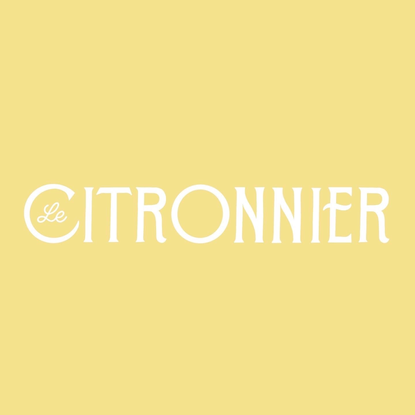
This was one of the most enjoyable, refreshing designs to work on all month. Le Cirtonnier was a luxury resort in the French countryside with a restaurant and hotel. I wanted the lettering to be a little bit art nouveau while still feeling clean, fresh and a bit modern. These colors were very inspiring to work with and I had a lovely time creating this lettering!
DAY 11: THE GOLDEN PEARL
All the very clever funny prompts for this project (including this one,) were made up by Laura! The concept for this brand was that it was a luxury cruise ship where the rich could travel discreetly. “Rumored to host excursions for spies and superheroes.” I felt the best route would be to do some very over the top high contrast script lettering. Lettering like this isn’t always the best choice for a logo since it can sometimes be more difficult to read, but since this brand was not concerned with being accessible to the masses, I thought it would be appropriate.
DAY 12: CHERRY ON TOP
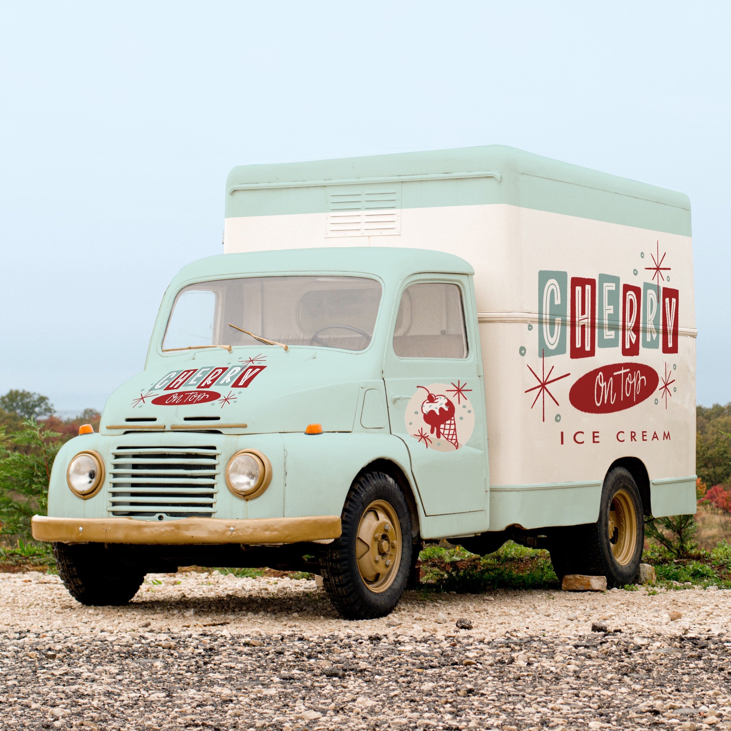
Who wouldn’t want to design a logo for a retro ice cream truck? As you may imaging, this was right up my alley. One thing I really wanted to do was to show how the truck itself would look so I spent the bulk of my time working on a mockup of an ice cream truck. The lettering was inspired by 1950s advertising.
DAY 14:BLACK EYED SUSAN
You may notice that I skipped day 13. I was not a fan of how my logo for day 13 turned out, and since this is my website and I can do what I want, I’ve decided to skip it! I was however, very pleased with this lettering logo design for Black Eyed Susan Boutique! As I’ve mentioned before, modern design isn’t my first choice and I typically don’t love making things that feel too modern. For this design I felt that the way around doing modern clean lettering was to make lettering that felt very artistic and edgy with lots of movement and to pair that with clean, modern black and white photography. This one really got me out of my comfort zone and I am proud of the results.
DAY 15: COST AND FLOW
The lettering for this design really developed pretty naturally and I drew, and redrew these letterforms over and over. I wanted the lettering to have lots of movement since it was a skate and surf brand, and the cross bar turning into a wave was the natural result of that process.
DAY 16: RICO’S PESTS
I tend to associate pest control with obnoxious sales bros who value sales over honesty and good work, so my goal with this logo was to create something that did NOT feel that way. It was important to me that this logo should feel very personal and like a small business. I decided the best way to do that was to create an illustration of Rico himself so that people could associate an actual person with the brand. The lettering is inspired by traditional sign painter casual script.
DAY 17: SUGAR TYPE
This was a wacky one. The idea here was to design a logo for a make believe band that Laura and I formed called Sugar Type. It was silly since we don’t have a band and neither of us were 100% sure what sort of music we’d be playing (Bluegrass? Emo? Who knows.) I decided to just play around with the lettering and to have fun with it. One fun fact about this prompt: the colors were pulled from both my Type Affiliated brand, and Laura’s Sugar Grenade brand.
DAY 18: HERMOSO DIA
This logo was for a Mexican restaurant, and instead of doing the hand lettering from scratch, I decided to try out a new font I was just finishing up designing called Cogburn! Cogburn is a font I’d been creating for a long long time and this was the first time it made it’s debut in the world! Hermoso Dia means Beautiful Day in Spanish, so I thought a rooster would make a good icon since he’s the one who tells everyone that it is morning.
DAY 19:GOLDIE PRAWN
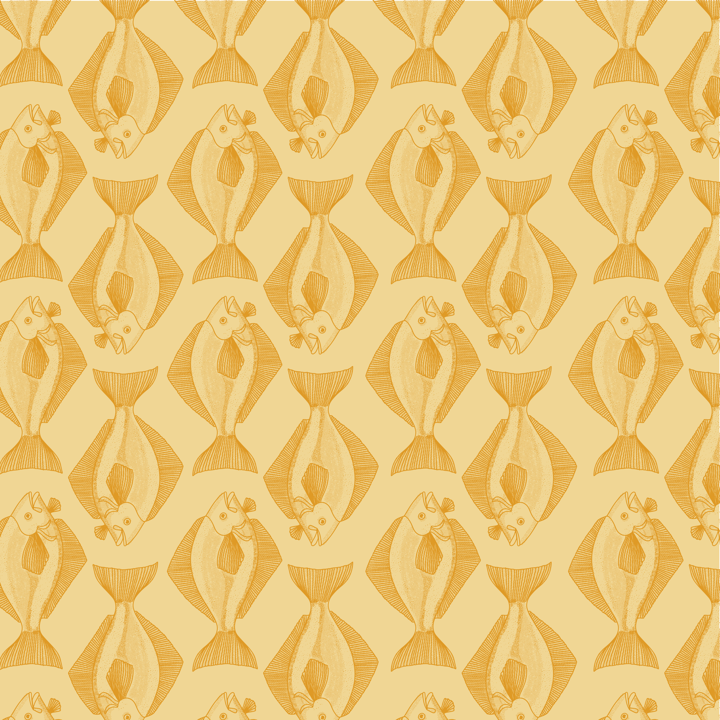
I don’t know why this one was so darn fun to design BUT IT WAS! On a lot of these designs I had to spend a lot of time drawing out ideas or trying to figure out what the right style for the design should be. But for this design, I knew exactly what style I wanted to draw the lettering in, what I wanted to do for the illustration and exactly how I wanted to format it. I think part of what made it so fun was the colors. These are colors I wouldn’t have picked on my own, but for whatever reason they were so inspiring. Also I love drawing fish so that may have had something to do with it.
DAY 20: VESPA ITALIA
Research is always an important part of designing a logo, and often during this project, it was a step that there just wasn't much time for. However with this logo I spent a lot of time looking through my vintage magazines because I wanted it to feel like it belonged in one of them. The color palette came directly from one of my vintage magazines and the lettering was inspired by the lettering on the side of cars during the 1940s-1960s. I was extremely pleased with this design and working on it was a pleasure.
DAY 21: MARVEL AND BLISS
I don't have much to say here beyond the fact that I love this style of lettering and would be happy to do this style of work every day of my life.
DAY 22: PUMPERNICKEL BAKERY
The process for designing this logo was fairly quick. I drew the design on paper and image traced it in adobe illustrator. This usually is not a great way to design a logo, but for this specific icon I wanted the drawing to be rough and organic so it worked well. Looking through the designs that everyone created this day made me terribly hungry.
DAY 23: NIMBLE THIMBLE
We have a sewing shop here in Provo so as I was designing this logo, my goal was to create something that would feel at home in that shop. I liked the idea of making something a bit more decorative and detailed. I also thought it would be fun to have it look like a cross stitch.
DAY 24: APERTURE
This one was tricky. The idea was to design a logo for a font design software. My idea was to design a logo that would work well in lots of different typography styles. I created a GIF where the style of the lettering actually changed which I thought was clever.
25: TATTY BOGLE
Another vintage inspired logo! Of course I was happy to work on this one and really wanted to do a script that felt manly. I wanted it to be a place for gentlemen and had a lovely time working on it.
26: BAD MEG’S
Bad Meg is the name of a motorcycle that my husband Allan has been building and I thought that would be a great name for a motorcycle repair shop. I also thought that for this brand it would be great to use real photos so I took some photos and videos of Allan riding one of his other motorcycles. Gritty brands are always the best to work on.
27: TUSSIE MUSSIE
This one was hard! I have to admit, these colors were so crazy and that really baffled me, but I still felt like I did good on the lettering. My goal on this one was to make lettering that felt loose and girly but also with sharp edges to keep it modern and not too round. This is one I’d like to go back and add some illustrations to sometime.
28: COWBOY JIMS
Here’s another design where I had the chance to use my Cogburn font for the design! I also created an illustration for this one inspired by the types of cowboy illustrations that you find in old 1950s picture books about cowboys. Part of me has always wanted to live on the range and be a cowgirl so this was enjoyable.
29: PUPPER STRUTTERS
I’m not much of a pet person, but my one goal for this design was to draw a happy dog. I wanted the dog to look REALLY HAPPY and I feel like I accomplished that. The other thing about this design is that I drew the whole thing in my car while I was waiting for my husband to do some things.
30: GRACIE’S
This logo was a clean simple brand, so I wanted to make sure the logo was clean and simple. It’s as simple as that.
31: LOUD AND CLEAR
The last day! While I was designing this logo, I was also planning a trip to New Orleans so I wanted this jazz club to have a very traditional feeling to it. I loved these colors and the time period so I thought this was a great way to finish things up.
And there you have it! Those are all the designs that I created over the course of 31 days! Let me know in the comments which is your favorite!


